The Divi Visual Builder is what we use to create our content for pages in a live front-end view. We use this for any page listed in the Pages menu and for page templates we have prepared in the Theme Builder.
Before we dive in to each module, this section will give you a quick understanding of the builder functionality, controls and layouts. To enter the Visual Builder we must go to Pages Menu > Select Page > Edit With the Divi Builder.
Let the page content load fully, it may take a few seconds to render our 365Villas plugin modules. Please note: some modules that are linked to the property API may display differently to the front-end live site and this can be ignored.
Section Types
You will notice as you mouse-over elements on the page that there are different color containers. Each color represents a section type, start from the largest:
Purple – Full-Width Sections
For modules you want to display edge-to-edge, usally background images or sliders.
Blue – Standard Sections
This is a standard section which keeps the content within a set container/page width

Green – Row/Column Sections
These are located within the above blue sections where you can format the width of your columns and rows within the section.
Grey – Module Sections
These are the tools we use to create the page content, which sit within the above green column sections. These are what you will be editing 90% of your time.

Lime Green – Global Sections
Any of the above section types can be converted to a global section/module. These sections appear in more than one place on the website and are linked so you can edit on just one page and it will update the section site-wide. They are saved in the Divi Library in your CMS.
Red Padlock – Code Sections
These sections have been marked as locked (although you can still enter them) to mark them as elements that are not edited in the visual builder. These can be avoided unless you require advanced custom development.

Toolbars
All the above sections have the same toolbar on mouse-over.

- Move – Drag your section
- Settings – Content, formatting and styling configuration
- Duplicate – Make a copy of section
- Save Section – Save section to Divi Library
- Delete – Remove section
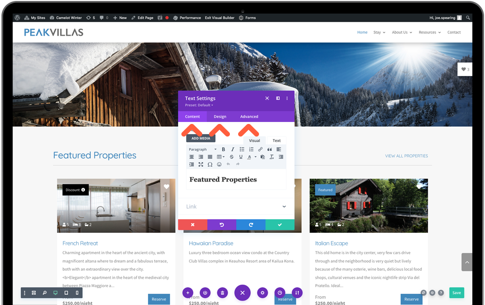
Settings will be mosty heavily used, which is split in to 3 tabs of Content, Design and Advanced. You may visit the Design tab for initial setup of styling but Content will be the go-to place for add/editing your website text and images.

Important: Always remember to confirm changes made with the green tick (or ignore them with the red close) or you edits will revert back. This does NOT save the page yet, see below.
Menus
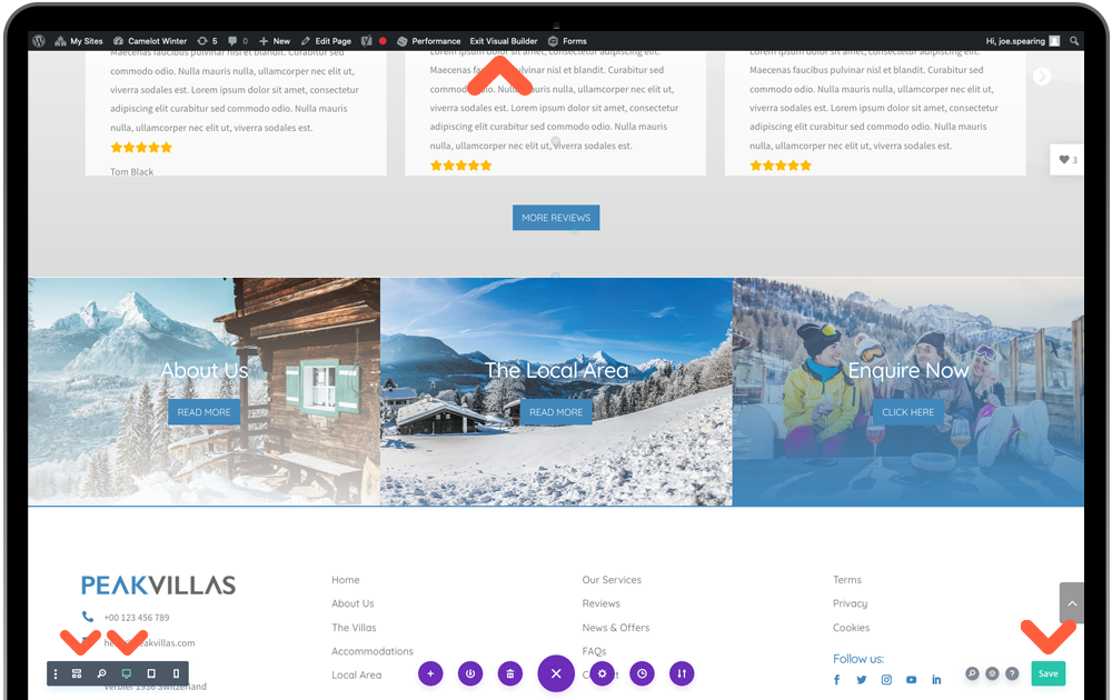
Click the 3 purple dots at the visual builder footer to open up the page menu. The 3 areas this guide will cover, working from the left is:

Wireframe View
This is an alternative view of the page to the live view of the visual builder. It shows a section view of what we have covered above, color-coded and labelled for clarity. We recommend using this in some intricate edits, covered later in the tutorials.
Device Previews
These 3 device icons will allow you to preview your webpage on three default device sizes of desktop, tablet and mobile. Once you enter tablet view you will also be presented with a dropdown list of device models for more detailed inspection.
Save Button
Always remember to save changes! You may need to be a little patient at times and allow the button to stop spinning and display the tick icon.
Exit Visual Builder
This can be done from the WordPress topbar. If you wish to leave and visit the current live page, click Exit Visual Builder. Or to go back to your WordPress CMS click Dashboard from the top-left dropdown.
